
You can find inspiration everywhere you look. Don't take anything for granted. When you are running errands, stop and take in the architecture of the buildings around you. What colors do you see? Examine how the light affects the surface of the building. How do the tones reflect against the environment?

{The warm colors of clay, green and creams remind you of the desert while inspired during late afternoon in the city}


{Colors of late summer with a touch of peach will make you feel the cool whispers of the trees dancing in the breeze}
Nature can be the best place to find ideas. Since Mother Earth has created such a beautiful palette for us, we just have to take what makes us feel good and go for it. Blues, greens and neutrals are just the beginning. The seasons carry bright autumn hues, winter whites and flowers born with every color of the rainbow and beyond.


Nature can be the best place to find ideas. Since Mother Earth has created such a beautiful palette for us, we just have to take what makes us feel good and go for it. Blues, greens and neutrals are just the beginning. The seasons carry bright autumn hues, winter whites and flowers born with every color of the rainbow and beyond.
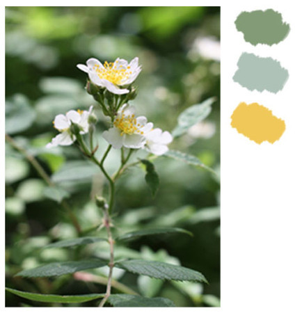
{With a calm olive being the main color, the light blue and cheery yellow add the colors from a spring garden}

{Cool blues and gray with a touch of brown mimic autumn birch trees while the soothing mustard yellow adds some brightness and warmth}

{Brown and olive green neutrals keep this palette calm}
Another way nature helps us in the color department is through food. Everything that grows from the Earth is unique. Depending on its nutritional content and origin, veggies, fruits and plants provide an array of colorful ideas. The next time you make dinner try arranging the plate with style. Don't forget to take a picture!


Wherever you find inspiration, it's good to start with one main color and then pick no more than three to compliment it. Keep saturated, bright colors to a minimum and muted; darker tones for backdrops. As long as they all come together in harmony, your project should be beautiful.


{I am currently working on a series of Photographic Palettes with Kate Smith for Sensational Color and so excited to start sharing them with my readers. So many new and fun projects lined up for 2012 so keep an eye out and I promise to keep you posted}

{Olives and creams contrast each other while mustard and brown helps even out this pasta inspired palette}

{A warm hearty breakfast shares a neutral toned backdrop with light touches of creams and lavenders}
Wherever you find inspiration, it's good to start with one main color and then pick no more than three to compliment it. Keep saturated, bright colors to a minimum and muted; darker tones for backdrops. As long as they all come together in harmony, your project should be beautiful.

{This nautical themed palette of neutrals will create a calm and relaxing space in any home}
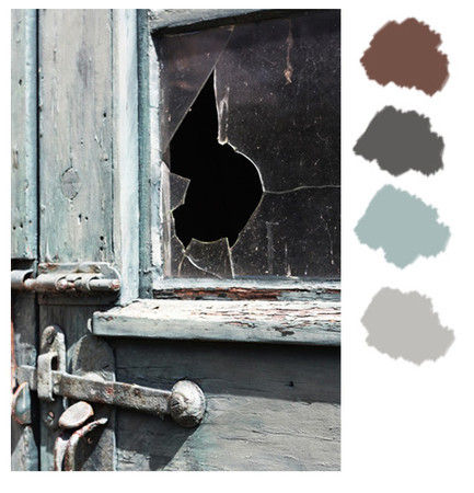
{Vintage blues and grays set a nice tone for the reddish brown and dark cream to create whimsy}
{I am currently working on a series of Photographic Palettes with Kate Smith for Sensational Color and so excited to start sharing them with my readers. So many new and fun projects lined up for 2012 so keep an eye out and I promise to keep you posted}
No comments:
Post a Comment