Monday, December 19, 2011

DIY Save the Dates

Not everyone can plan their own wedding and create the decor. However, with a little help you can surely make your own save the dates. Personally, I think the save the dates should be simple and affordable. If you want to go nuts than save it for the invites. Being that its just a little reminder of what's to come, it doesn't have to be grand. Check out what I did for mine and hopefully they will inspire you!

I chose to create postcards for a few reasons. First of all, they are very affordable and easy to get printed. Second, our wedding theme is vintage bohemian so what better way to remind our guests of our special day than with a vintage postcard design.


I chose to use one of my favorite photos from our engagement shoot with Lauren Elle and just create a small banner that matched the style of the photo. For the back I used a vintage texture and included fonts that held that antique style. Since we have a wedding blog I included that as well.

I received a lot of positive feedback about them which made me happy. Especially, since I designed them. I say DIY all the way. If you can do a lot of the work and it will save you money than go for it.

Wednesday, December 14, 2011

BHLDN Moodboards

BHLDN recently had a contest and all you had to do was create a moodboard to enter. Eventually, they would randomly pick someone who would win what they included in their board. How rad is that? They just announced the winner and let me tell you, she is one lucky girl! I did, however, want to share the three moodboards I created on the BHLDN website. I think they are quite cool :)

Bride & Maid of Honor
What a beautiful pair these two make. Keeping with the vintage bohemian feel, everything is nature inspired with neutral tones and sweet hints of color.


Rustic Woodland Themed Wedding Decor
I love the faint calm colors of natures neutrals with a pop of color. Adding textured objects and vintage elements bring a nice theme to the event without being too much.


A Vintage Celebration
A small gathering with vintage flair and neutral tones.

DIY Creative GIft Wrapping Ideas

Giving gifts is a big part of the holiday season. Besides decorating and spending time with loved ones its my favorite thing to do. I absolutely love giving presents. But one thing I love even more is wrapping them. I suppose some people are not amused by gift wrapping, especially if they have stacks of them waiting to go under the tree. But stressing over the holidays shouldn't be an option. It's a time for cheer, happiness and lots of love.

Here are some easy and unique ideas that will make your gift wrapping experience quick and fun.

Eco - Friendly

For all those green people in your life, why not express their love for the Earth by presenting their gift in an Earth friendly package. I am sure they will appreciate the gift much more. Try using brown packing paper or simple white recycled printing paper to wrap it. Instead of using ribbon, hemp string or a natural fiber to tie around it will do the trick. You can leave it as is or design it yourself with stamps or drawings.

Consider it a blank canvas so get creative. You can even get the kids involved. Have them draw and color on the paper before you wrap it. Color Tip: robins egg blue or a shade like it is a great match for brown if you choose to use packing paper.


Reuse & Recycle

Considering people tear up the gift wrap anyway why not save some money and time and use magazine or newspaper pages. You can find some really cool imagery in magazines, especially the art and design ones. Real Simple, Oprah, Ready Made and Elle Decor are some great ones.

If you are wrapping small gifts than one page should do it. If not than just collect a few cool pages and connect them with some tape or staples. Depending on the pages you choose, either should look cool and different.

Know some vintage lovers? Look through old magazines for the perfect images that will set them back in time. For gift tags, you can use old holiday cards cut to size or cut cute shapes from the magazines' covers. They are made a little thicker and should work just fine.


Classic Style + Modern Flair

If you are in love with the classic style of gift wrap but want to be a little different no worries. It's always easy to add modern or eclectic touches to traditional design. You just have to be careful not to go overboard.

Try to experiment with color and aesthetic but trying new ways to wrap ribbons around the gift. Once you choose your paper, figure out where you want to take the story. What does the paper say through its color? For example; if it has holiday trees in blue and white then try using an unexpected color like orange or purple for the ribbon.

To get creative, wrap the gift numerous times instead of just once. I'm not saying put it in a straight jacket but two or three times will add a unique touch. Instead of using a bow, try another interesting and uncommon object like a small toy or flower. Pine needles from the tree would be work well too. It would be like two gifts in one!


Unwrapping a gift is a journey to an unexpected ending. It should be fun, exciting and in the end triumphant. Try to make it the best adventure possible from beginning to end and there will be tons of smiles everywhere. Plus, they will look fabulous under the tree.

Monday, November 7, 2011

Vintage Inspiration

I have just recently put up a ton of new vintage style photographs in my Etsy shop and I feel they are great inspiration for design ideas. Even if the theme has nothing to do with yours, you can use the color palettes and whimsy feel most of them have. I wanted to share a few here that I think are a great foundation for unique decor for your special events and home. Enjoy!


Thursday, October 13, 2011

Classic Black & White Weddings

There are tons of people out there that dream of a classic black and white wedding. Sure, it can be beautiful, but that is if it's done right. Every designer has their own opinion of what looks good and what doesn't so this is clearly my own. I try to inspire people with unique ideas and push them to customize their personal spaces and events so it represents them. Hopfeully resulting in great design.

We all know Kim Kardashian recently got married. Her wedding was a huge event that cost way more than I will make in 3 lifetimes. I guess since she had endless funds you would expect her big day to look spectacular. I think it was the opposite. First of all, there was nothing done that was special or unique. Second, there was way too much of everything. Totally overdesigned. Third, from the photos I saw it looked kind of boring.

Those are three things a wedding should not be. And what ever happened to the romance and intimacy of sharing your vows with the one you love? Obviously, that wasn't on Kim's mind. Here are a few elements of her day that surely didn't inspire me.

Colors
Even though this was a black and white wedding, I feel the black overpowered the white immensely. It makes everything look so dark and masculine. The seating area looked like an event for a mens magazine more than a wedding. The ivory bouquets just fade away and its too bad because they were one of the very few elements that were actually pretty.

Overdone Elements
I'm not a big fan of big and tall centerpieces but as long as people can see each other and talk its not the worst it can be. Unfortunately, what was done here just added to the abundance of overapplied design. How many chandeliers can you have before the whole place looks gaudy and old fashioned? Less than what Kim had for sure. These were over the top and unessasary. None of it looked classic at all.


Stuffy Atmosphere & Bad Design
The tables had so much stuff on them I wouldn't be surprised if the guests felt a little claustrophic. The first thing I noticed about the photo below was the table card. It looks like clip art and somewhat cheesy. Again, that unique artsy design element was nowhere to be found. On paper elements such as invites, seating cards, etc...is where your creativity can soar. But I guess if you're not creative or have a good designer doing the work, it just won't be successful.


Cake Design
And then we get to the wedding cake. Granted, you don't have to have one. My fiance and I are having cupcakes instead because they are more our style. Plus, a little more fun. However, you should want your cake to match the style of the event which Kim did do. Unfortunately, this was a disaster as well.

Personally, I don't like when people think they are king and queen status. This cake was friggin huge. But at least it could've looked somewhat beautiful if it was all white. Those two black sections just ruin the whole thing. A better way to incorporate the black is to use it for the ornate details which was actually quite gorgeous. It would of made them stand out more without being so overdone.


So, to sum it all up: Never have too much of something. Regardless of what you think or like, it will look overdone. Just because you love a certain pattern or color doesn't mean you should see it everywhere. Why suffocate your guests with an overabundance of one element when you can incorporate numerous ideas into your design. It will only reflect your creativity. Also, remember that classic means clean lines and smart design. You can have a luxury feel at your event without going overboard and looking gaudy and old fashioned. And you can certianly have a classic feel without it being black and white.

Be smart and do your research! Here are a few classic weddings that were done right. A little inspiration to leave you with :)


Thursday, August 18, 2011

The Natural Palette

Recently I have been working with color expert Kate Smith which has inspired me to think more about color. Since nature is where I get most of my inspiration from I wanted to share some tips on how to use the natural palette in your home.

Analyzing a space is a smart thing to do once in awhile. I recommend you do it every six months or so. Tastes change and so does your life. Adjusting your space to your everyday is how you will get the most out of it. If you aren't benefiting from your home than something is wrong.

A place to chill out should be reminiscent of what you love. What makes you truly relax? You should be able to clear your mind and be totally comfortable. For me, nature is my true love. So I take colors from Mother Earth and bring them inside my home. This means using neutrals such as blues, grays, browns, greens and colors from fruits and veggies. Natural tones in nature is what helps me sit back and relax. I find that most people feel the same.


{Seeing nature as a whole is truly breathtaking. From the sky to the water, you will find inspiration from every angle}

Now, this natural palette isn't just an inspiration for color but also how to use it. If you look outside the Earth seems so perfect. Trees have brown bark to ground the green and many other lighter colors in their leaves. The sky is all sorts of gorgeous blues, whites and grays while the ground presents more greens and browns. This is a free lesson in how to coordinate and arrange the colors in your home. So, mirroring nature in your space is a great way for successful design to shine. Put the sky on your walls so the room feels airy. Depending on the tone of the color, the trim can be crisp or slightly blend in for a softer look. Antique whites, creams and light grays work well. 


{Look closer to find various tones and hues of color on trees during different seasons as well as notice all the different colors in the leaves}


{The colors of autumn are a true inspiration for spaces to feel warm but relaxing}

Flooring should ground the room and provide the necessary weight for all other elements to feel natural. You don't have to necessarily have really dark floors, but they should be a darker color that the walls so their is some type of contrast. The more texture there is, the more warm the space will feel. Eco-friendly options such as bamboo, cork, cement, brick and stone play very well in a space like this. Adding a rug will bring even more comfort and warmth.

Your furniture should also help weigh down the space. Having pieces appear as they are floating can somewhat look out of place. You want a consistent feel to the room. For a more spacious design stick with darker toned pieces that aren't heavy. Maybe they have open shelving or thin legs, either way it will work. If you want or need more heavier furniture that is fine too. Just take note of size and the proportion to the other pieces in the room.


{A great example of how texture in natural elements can bring so much to a space. See all the various gray tones from the Earth}

Your accessories are the details that bring the whole room together. From the window treatments and lighting to smaller decorative items such as vases, trinkets and books. Pops of color bring a whimsy and fun feel to the room so look to the seasons for inspiration. The details on your furniture play a big part as well. Handles, knobs and special engraving can sometimes make or break a space. If you are incorporating grays in the room I suggest colder metals like silver. Warmer highlights such as golds and brass, go well with autumn colors like red and orange.


{Light wood tones and soft colors make this bathroom calm and soothing. Silver blends nicely with the colors of the room}

Color is so important when creating a space. Especially, one that is meant for relaxation and comfort. Feeling like you are at a park when in fact you are sitting on your couch reading a book, is a successful result to great design. Everything should accent each other and blend in a natural way, as if the room was meant to look the way it does. So sit back, take a look around and discover the power of color in your home. Creating a space that empowers, inspires and keeps you calm when the day is rough truly makes all the difference. I can guarantee you will be smiling more often.

Sunday, August 14, 2011

Beautiful Banners

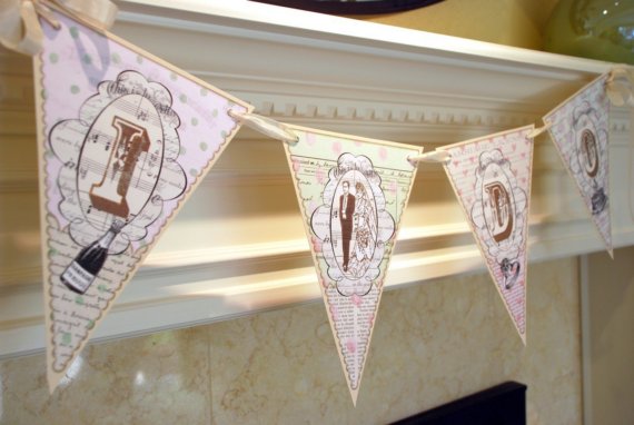
Being a lover of anything handmade, it is no surprise I would love banners. Not only are they easy to display but there are so many out there, the possibilities are endless. Plus, you can make them yourself. If you are not as crafty as you wish you were, here are some I came across on Etsy that I think are really great.

These would be an awesome addition to any event. Having items that are unique and handcrafted really add a sense of style like no other. Have fun shopping around and I hope these give you some inspiration to design with confidence and style.

Betty and Barclay


Barbara A Ryan


Bnute


Earmark


Postscripts


Funky Junk Art